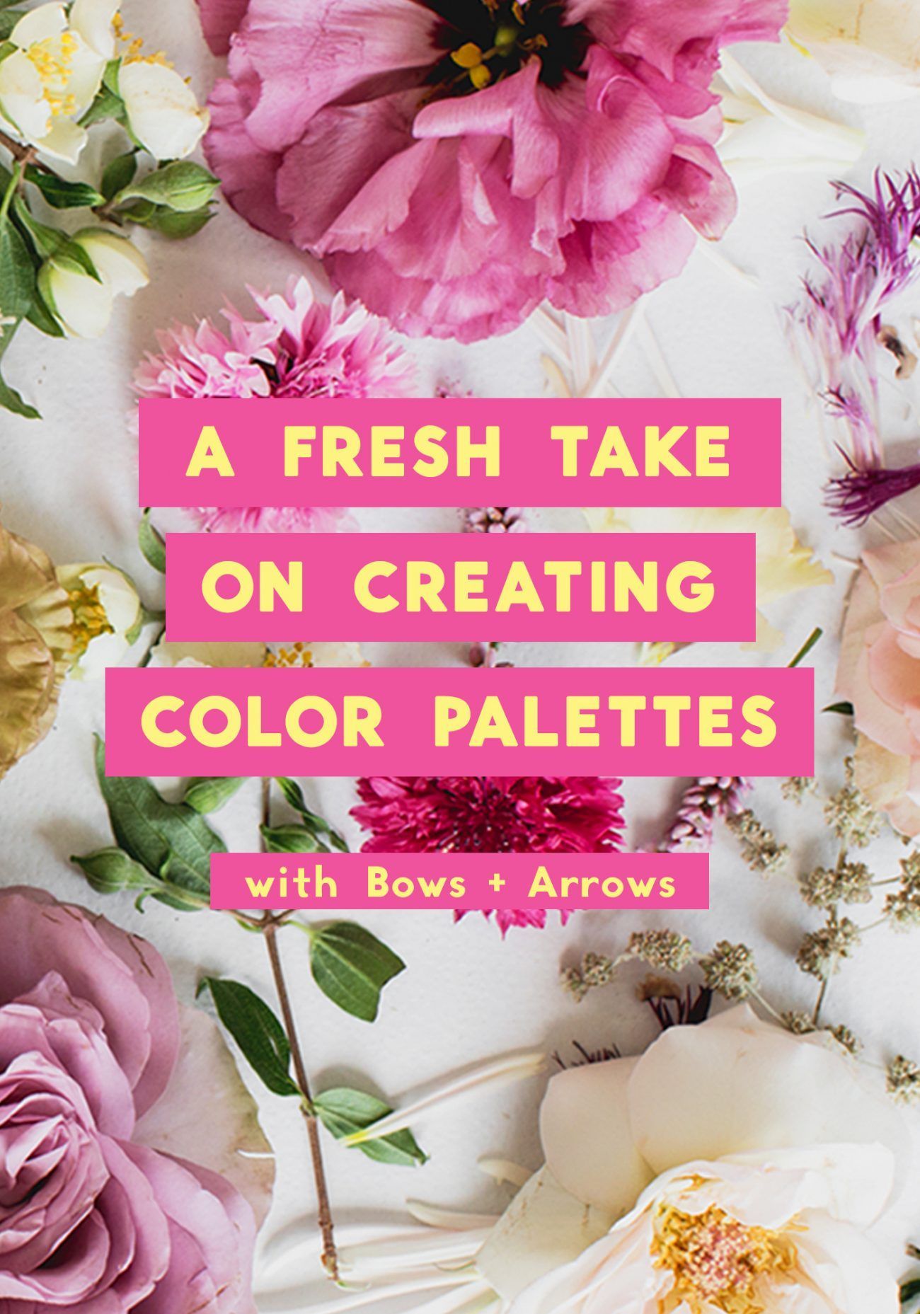
If it seems like Bows & Arrows Flowers know the secret to color mastery in floral design, it’s because they do. We asked Adam and Alicia to spill their secrets on how their background in fine arts has given them a unique perspective on floral design.
Here’s a snippet of what they had to say. You can read the full feature on the If I Made blog
—
When imagining a floral design, we like to think about how we can create something cohesive and original as a stand-alone work of art. Both Adam and I (Alicia) come from a fine arts background (I went to school for painting and Adam for sculpting) so it plays into everything we create. We see each stem as a brush-stroke of paint—each dangling vine as an element of a floral sculpture.
We see flowers as a form of fine art.
To show you what we mean, we’ll approach floral design with one of our favorite elements in mind—Color theory. Color theory often drives our designs, so it deserves a lot of attention.
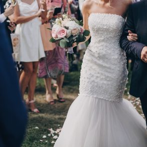
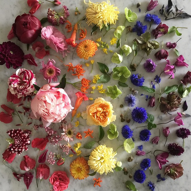 Image Credit: @bowsandarrowsflowers instagram
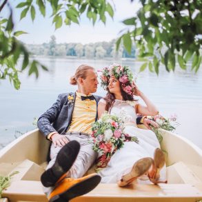
Color theory is essentially the structure for understanding how colors relate. We’re talking color wheels and rainbows here.
Simply put, color theory is about how colors look, work, and play together. It’s the string in the dark that leads us out of vague concepts and into purposeful design.
To best utilize our understanding of color theory, we like to think outside of the tube. When selecting flowers for our compositions and color palettes, we ask, “How is this color in real life?” Usually, you don’t find “pure” colors in nature. Reds, greens, and even whites tend to be more mixed, painterly colors in the natural world.
What we look for instead are colors which are both muted and saturated—which is just an odd way of saying: colors that are not so straightforward.
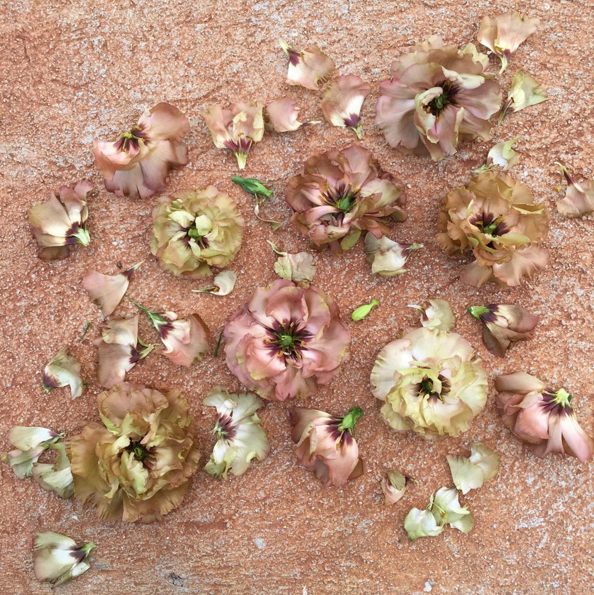 Image Credit: @bowsandarrowsflowers instagram
In a floral arrangement, these are the off-white garden roses, blushing peonies, mauve hellebores, periwinkle hydrangeas, salmon ranunculus, and soft coral dahlias of the world. These colors form what we like to call a “mature color palette.”
Since we personally value arrangements that possess a quiet sense of power and romance, a mature color palette is essential to us. As you grow, you’ll come to your own conclusions about what colors you’re drawn to and what colors best represent your designs and you as a designer.
To implement this concept into practical floral design, we’ve got two hands-on methods we use, called watercolor sketches and floral boards.