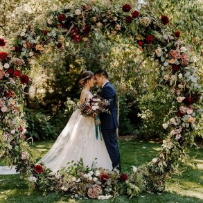
You may be catching on by now that this month’s inspiration all involves the color pink! This week I wanted to explore pink in a more natural, earthy context. And yes, that is a window filled with pink post-it notes….I see some kind of budget-friendly wedding decor idea in there, do you?
1. Hotel Azucar 2. Nicolette Camille 3. unknown 4. unkonwn 5. Jeanne Opgenhaffen (hers is made of porcelain but you could make a more temporary version from paper, right?)
I actually made a paper flowers bouquet in a similar color palette.
Also, I love the pink wall piece – is there a way to find out who made it?
Marija, i WISH i knew who did the pink post-it thing…i’ve been searching but haven’t found anything helpful…. anyone know?
Love the pink!
XOXO,
http://outfitidentifier.com/
Very pretty color combo!
I would try that color combination. I like using brown better than black.
What is that pink wall piece!? I want my own!!
mmm… one of my favorite Saipua arrangements.
I just got married a month ago, and that was my color palette! I was heavy on the ivories/whites, with just touches of pinks and browns weaved throughout. It was definitely very soft and romantic feeling. All the guys were dark espresso instead of black. =)
That furniture is great and who knew those colors would mesh so well together?
Brown and pink match beautifully!
Excellent. You show off the versatility of pink. I agree the pink window is fantastic.
I usually don’t like pink and brown but this looks great!
Love these colours and brilliant images. Really like the use of texture.